building on strong foundations
A logo is an important start, but it isn’t the whole story. The way a brand lives beyond that mark is what builds trust, pride, and recognition.
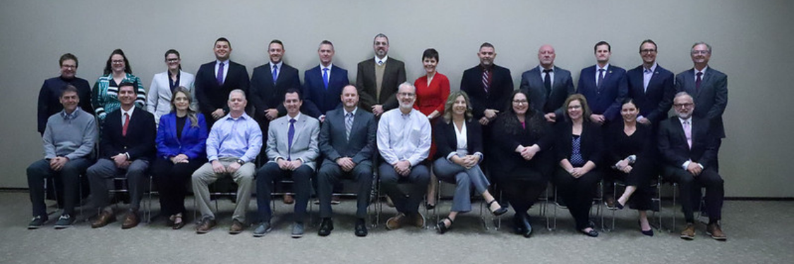
In Beyond the Basics, we explored how two districts (Butler County Schools and
Oldham County Schools)
expanded their visual identity into something deeper. Their brands moved from symbols to systems, from logos on paper to experiences people can see, touch, and celebrate.
the challenge: stopping short of full potential
Both districts had strong foundations. Their logos were clear, their colors established, their identity defined. Yet, the reach was limited.
The branding didn’t show up in the places where families, students, and staff actually experienced the district. Spirit wear, hallway displays, event signage, newsletters—all looked different. Without those real-world touchpoints, the brand felt quiet.
Staff often filled the gaps on their own. Turning a logo into flyers or templates became one more task to juggle. Over time, that led to inconsistency and fatigue. The foundation was solid, but it needed room to grow.
how alchemy helped bring the brand to life
1. building from what already worked
The existing brand foundations gave our team a strong starting place. Instead of redoing what was in place, we focused on translating identity into daily visibility—where people could see, feel, and use it.
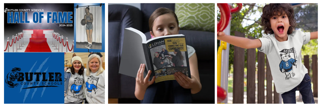
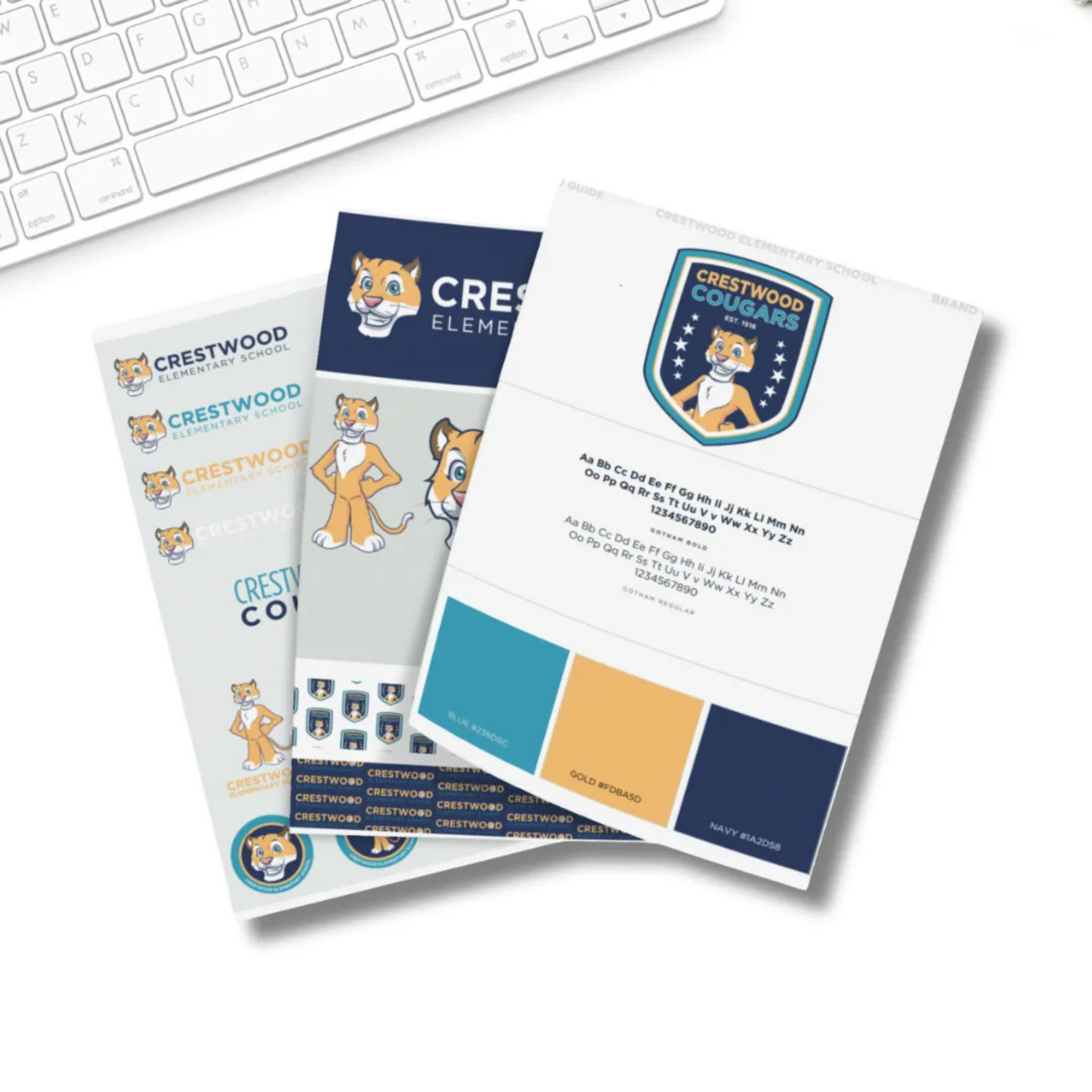
2. refreshing the mascot in butler county
Butler’s Bear mascot received a “retro refresh” that connected directly to the district’s core identity. The new design appeared on
hall of fame displays, signage, apparel, and community spaces, transforming the mascot into a unified visual presence.
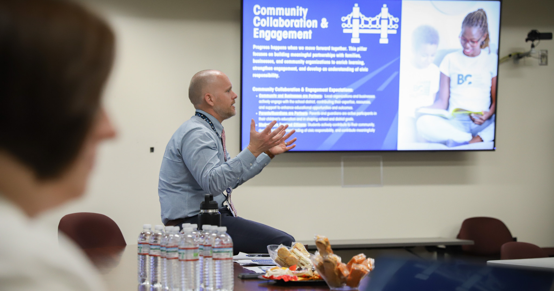
3. launching branded storytelling in oldham county
Oldham County brought its refreshed branding to life through a quarterly magazine—designed, written, and photographed in alignment with its visual system. The publication highlighted student success, district achievements, and community stories. It made the brand something to hold, read, and share.
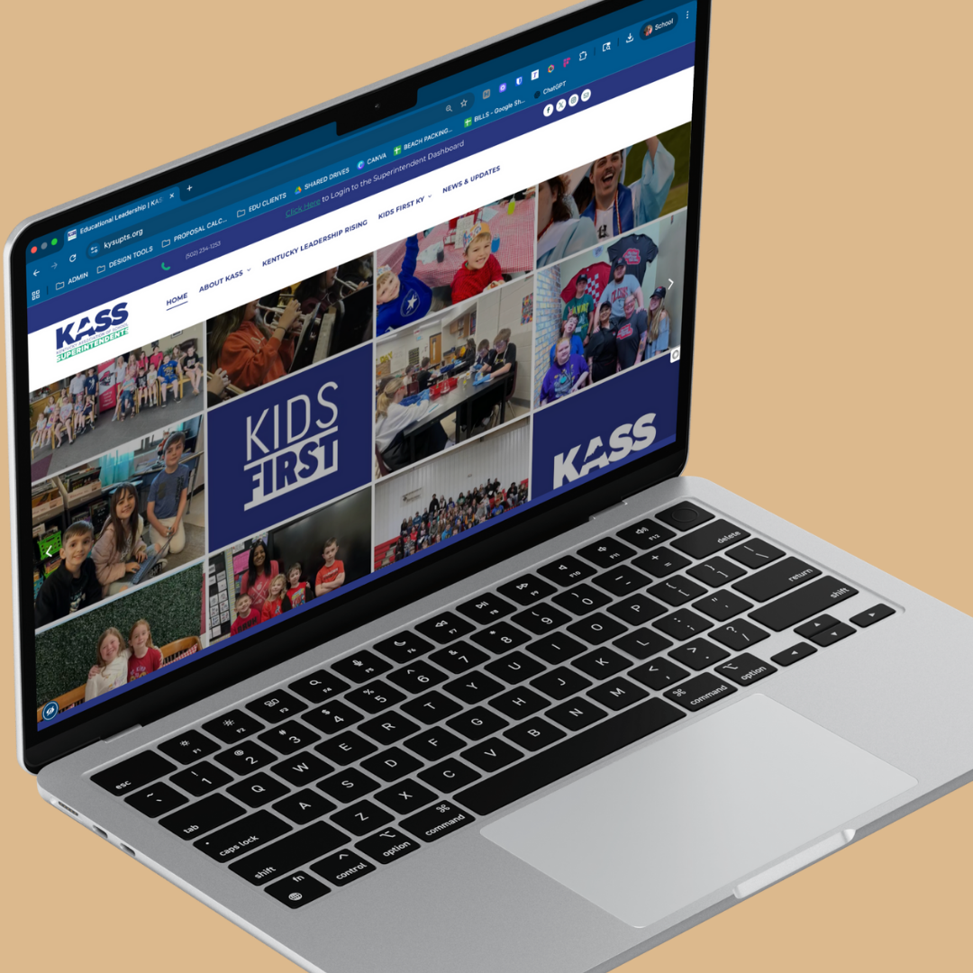
4. ensuring sustainability through systems
Each district received clear brand guidelines and ready-to-use templates. These tools gave staff confidence and autonomy, helping the brand grow consistently across every department. The systems turned visual identity into daily practice.
the results: identity lived out loud
- consistent visibility. The brand now appears across spaces, materials, and moments that shape how the community sees the district.
- renewed pride. The refreshed mascot and storytelling sparked energy among students, staff, and families.
- ease and efficiency. Templates and tools simplified design tasks and reduced time spent recreating assets.
- trusted recognition. The brand became recognizable—something people connect with emotionally and practically.
One leader described it best:
“Our logo gave us a strong foundation, but seeing it carried through to everything we do—from spirit wear to publications—solidified our identity. Our community recognizes it, our staff uses it, and it’s made a huge difference in how we show up.”
what we’ve learned along the way
- branding grows through application. A logo is the seed; the systems, templates, and creative extensions are what help it thrive.
- visibility strengthens connection. When identity is seen and experienced, it builds trust.
- sustainability matters. The right tools and guidelines empower staff to keep the brand alive.
- creative refreshes can renew energy. Mascots, magazines, and tangible assets give identity new ways to inspire.
The visual language of a district tells a story about its values. When that story is visible and cohesive, people see leadership, care, and consistency reflected in every detail.
ready to take your brand beyond the basics?
We help districts move from foundational logos to living brands that inspire connection and pride. Let’s build systems that help your identity thrive in every corner of your community.
explore our foundation services →