
branding + identity
your story deserves to look as good as it sounds.
At the core of every strong district brand is shared clarity about who you are, what you stand for, and how you want to show up in your community.
Once that clarity exists, we help districts translate it into a cohesive visual identity: logos, style guides, templates, and brand systems that work across schools, teams, and time. From bold rebrands to subtle refreshes, this is where visual clarity meets mission-aligned design.

your logo should carry a legacy
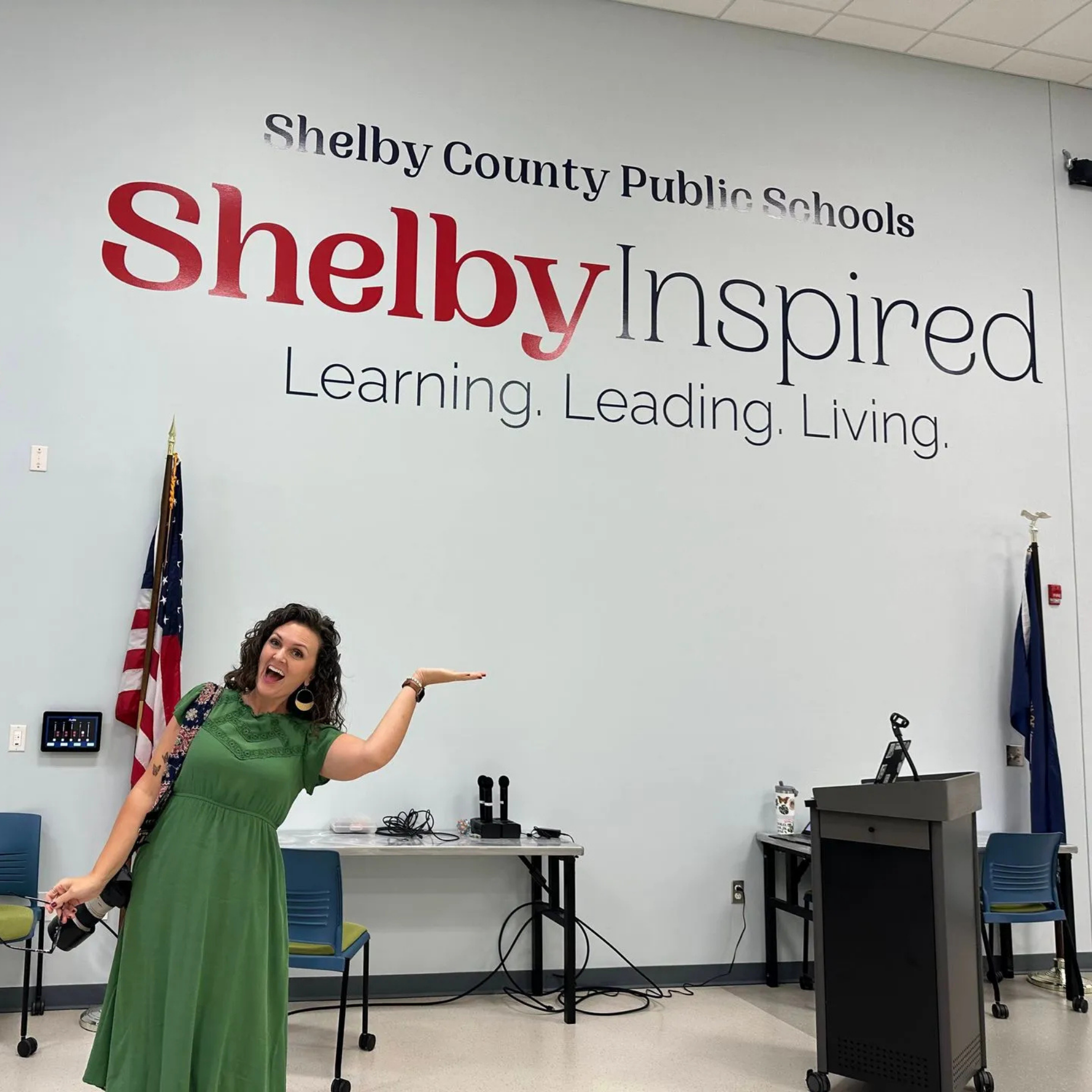
A district's logo isn't just a graphic. It's the mark that shows up on every jersey, letterhead, and school wall in the community. Shelby County Public Schools needed a visual identity that captured both where they'd been and where they were going. Alchemy walked them through brand discovery, design iterations, and a full rebrand that gave the community something they could genuinely claim as their own.

consistency creates confidence
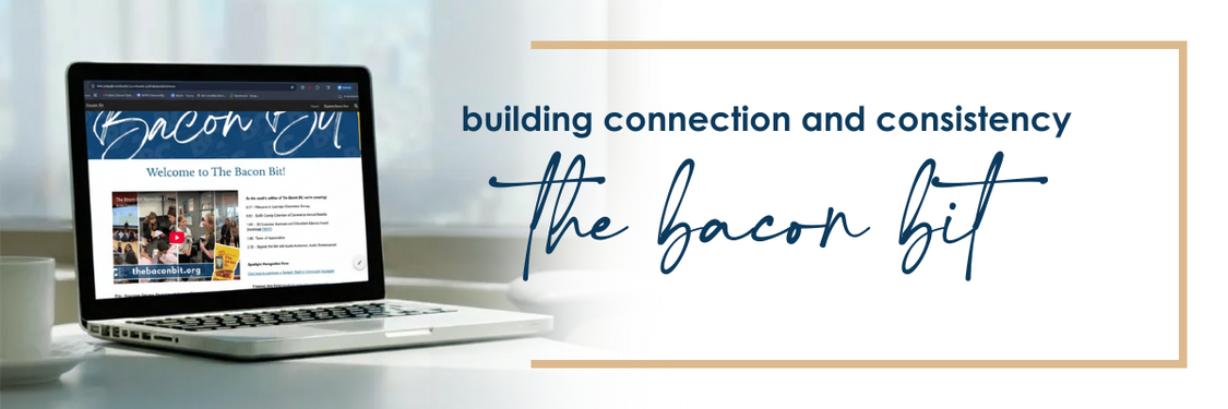
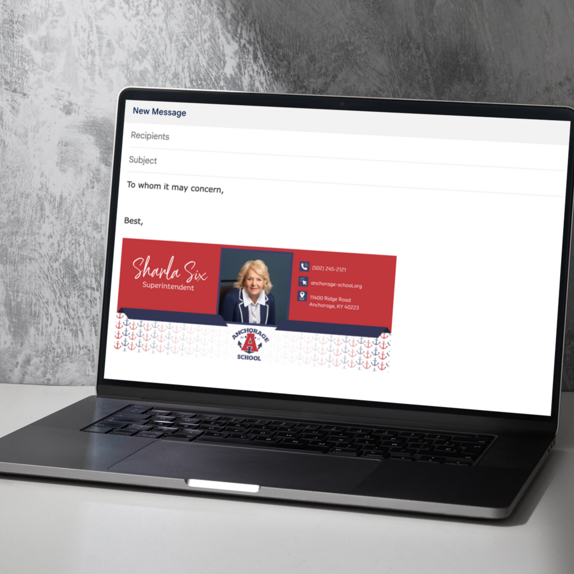
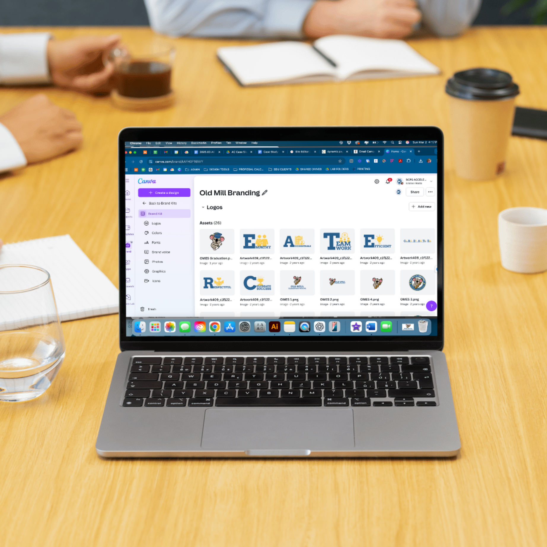
When every staff member is building their own version of the district's brand, consistency suffers and so does trust. These projects show how we've built design labs, brand kits, and template libraries that make it easy for districts to show up the same way across every platform, every school, and every communication. No more scattered files. No more second-guessing design.

identity is bigger than a mascot
A school's identity shouldn't live only on the football field. These projects show how we've helped districts expand their brand story beyond athletics: creating visuals and messages that celebrate academics, the arts, and the values that actually hold a community together. When every student sees themselves in the brand, the brand starts doing real work.